Skazka
Restaurant identity
Overview
"Skazka" is a modern concept restaurant offering bold culinary delicacies from Russia.
Description
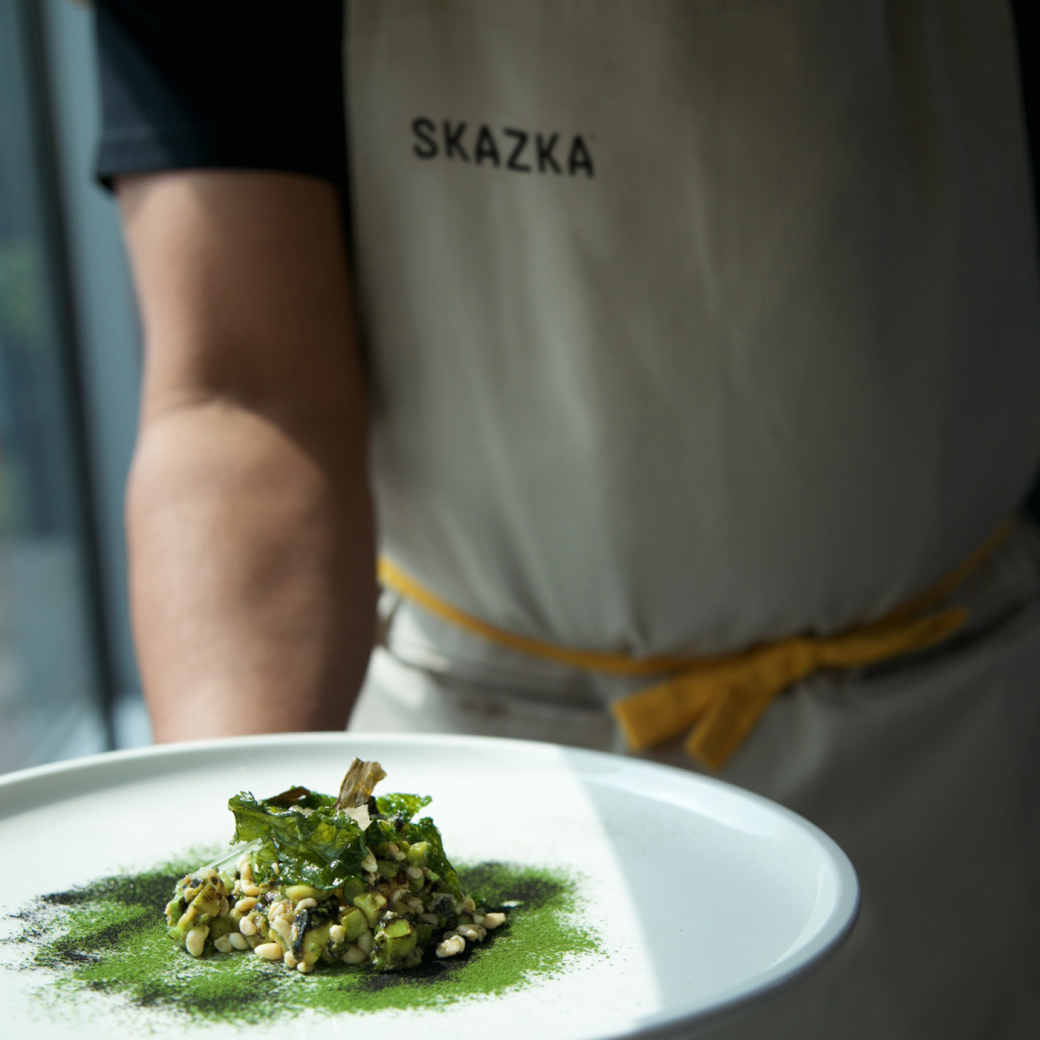
Our branding was designed to reflect the idea of an innovative culinary experience, created from local, eco-friendly, and seasonal ingredients.
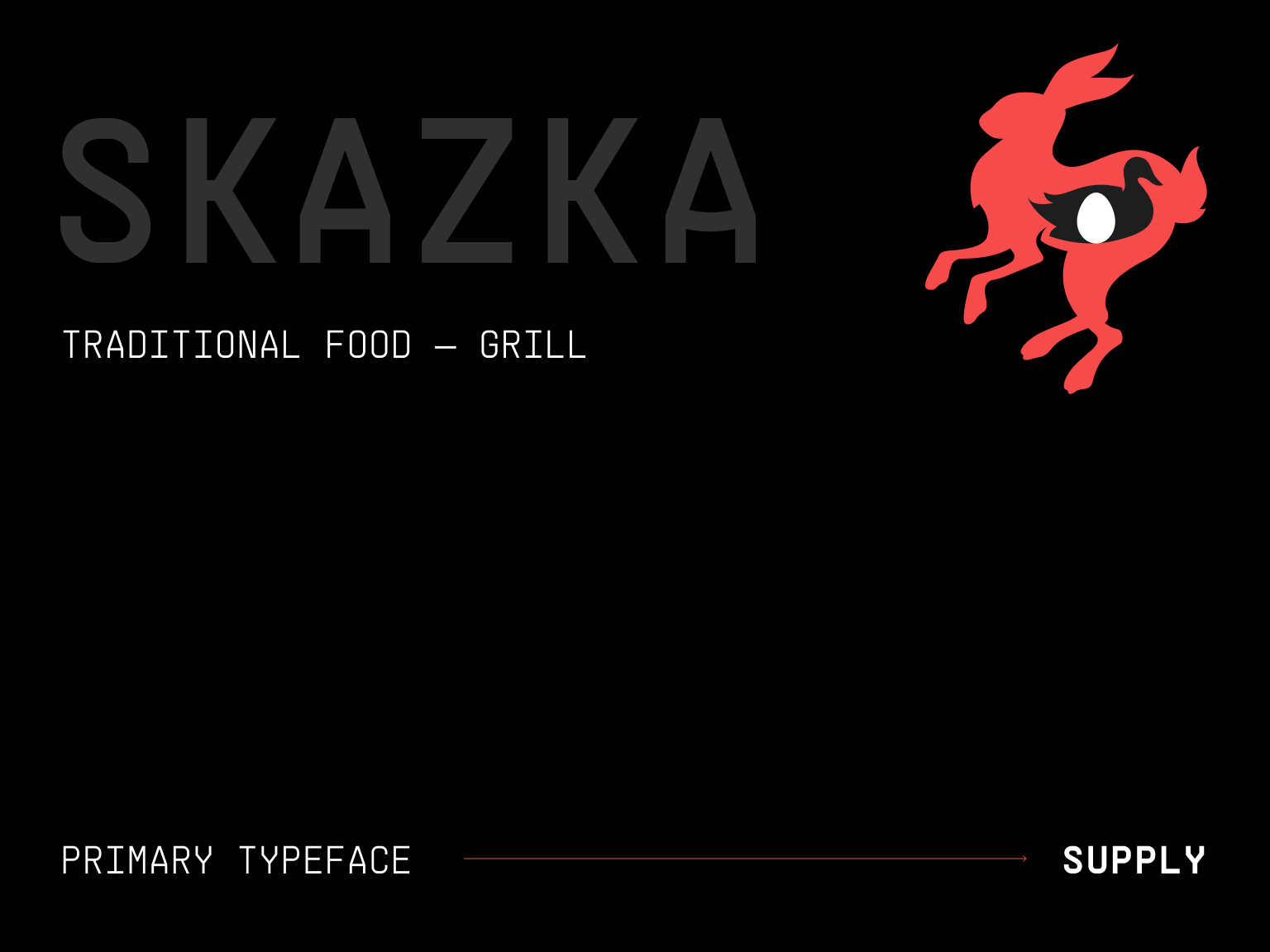
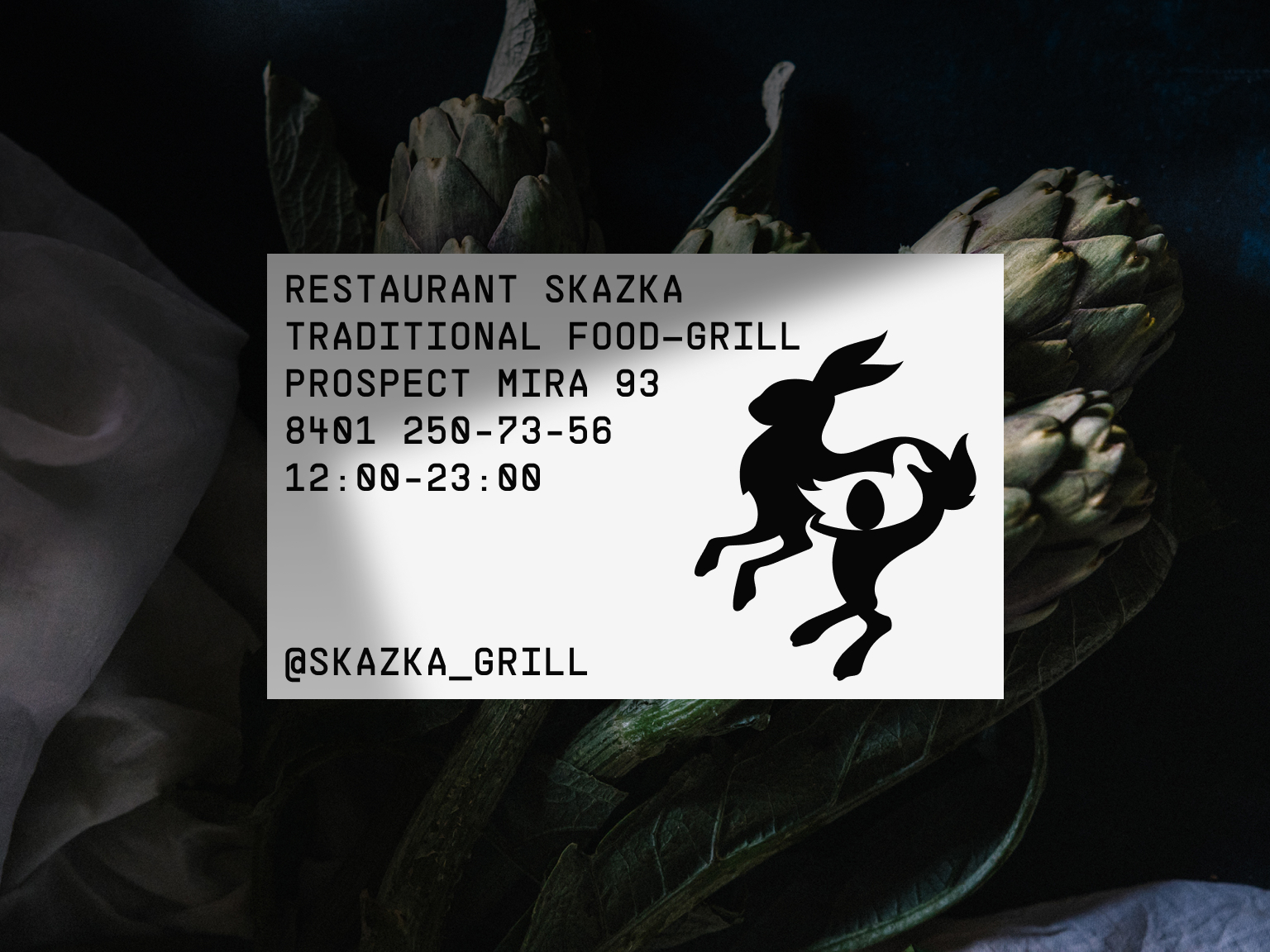
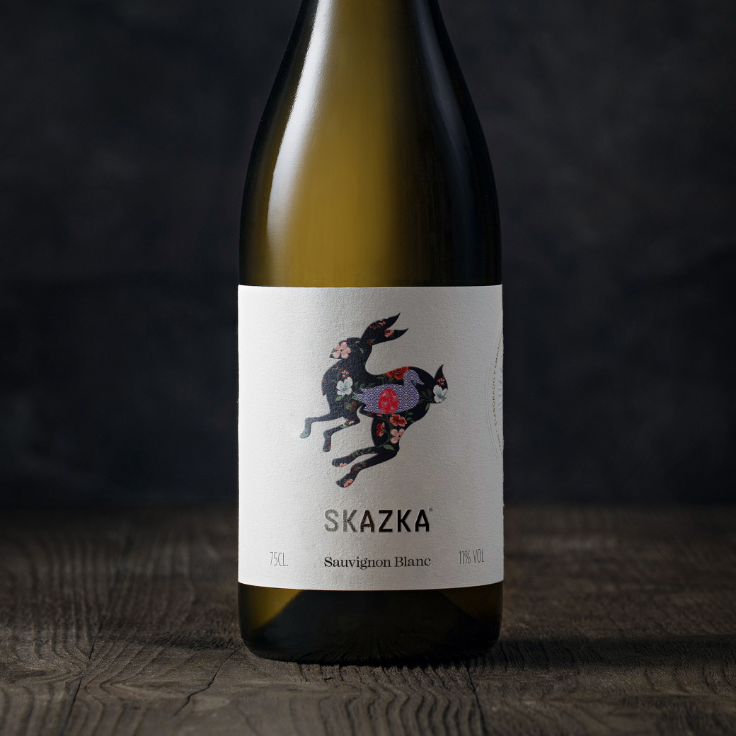
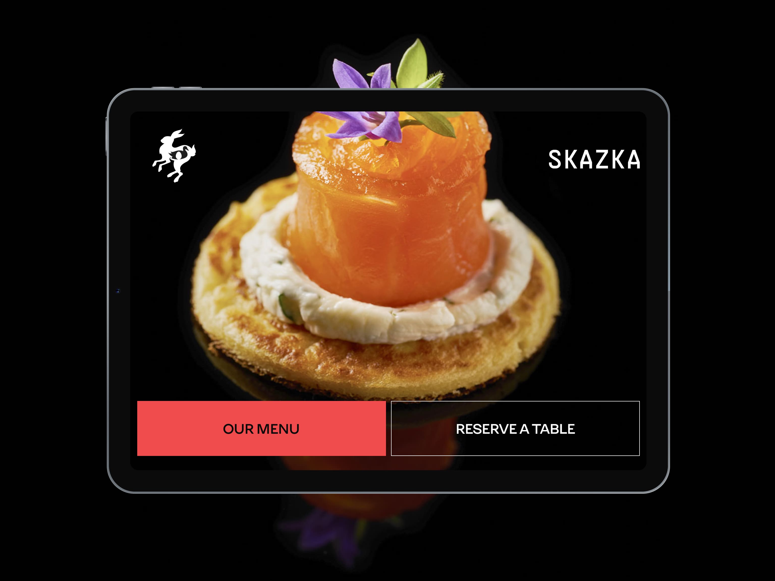
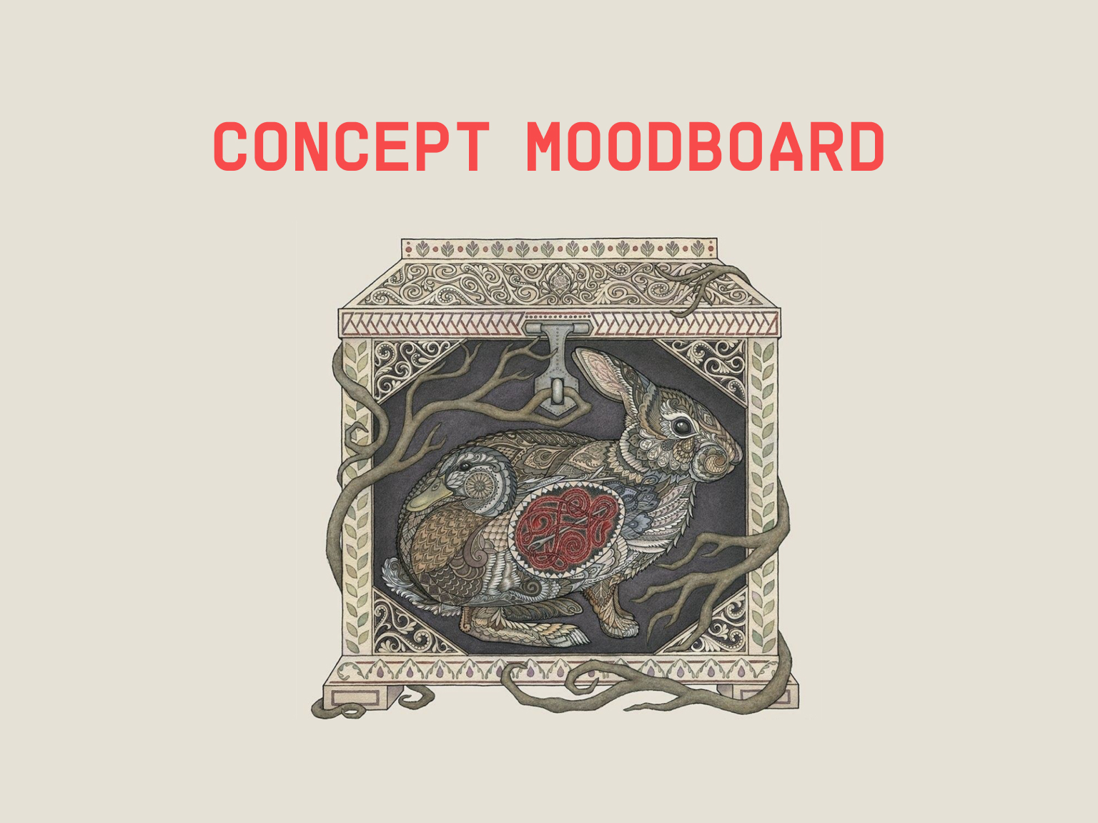
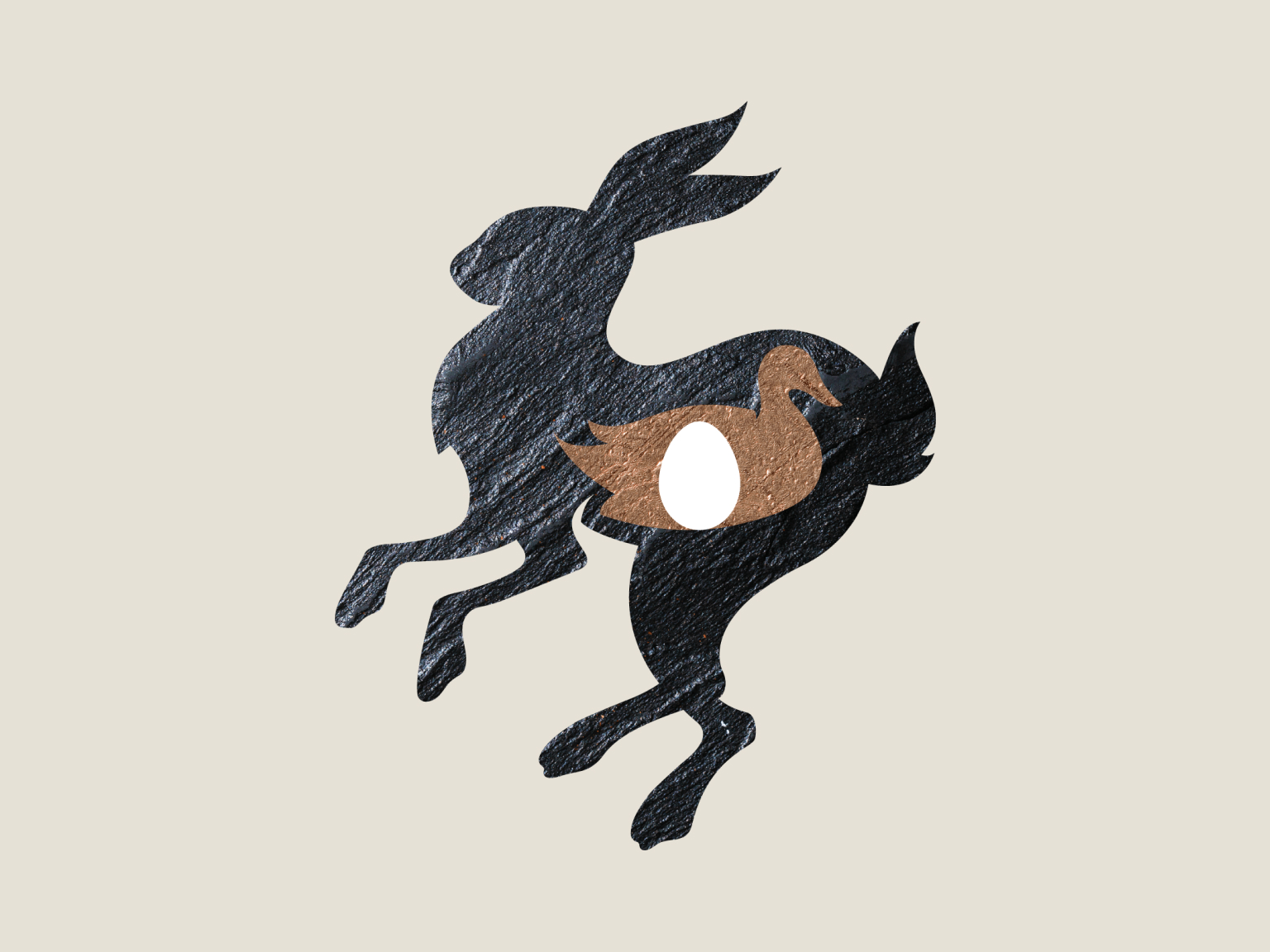
The main idea was to play with classic Russian fairy tales and their characters. The logo, referring to the hidden needle ("death" of Koschei), was made using the image-in-image technique and complemented with Russian folk patterns.
Process
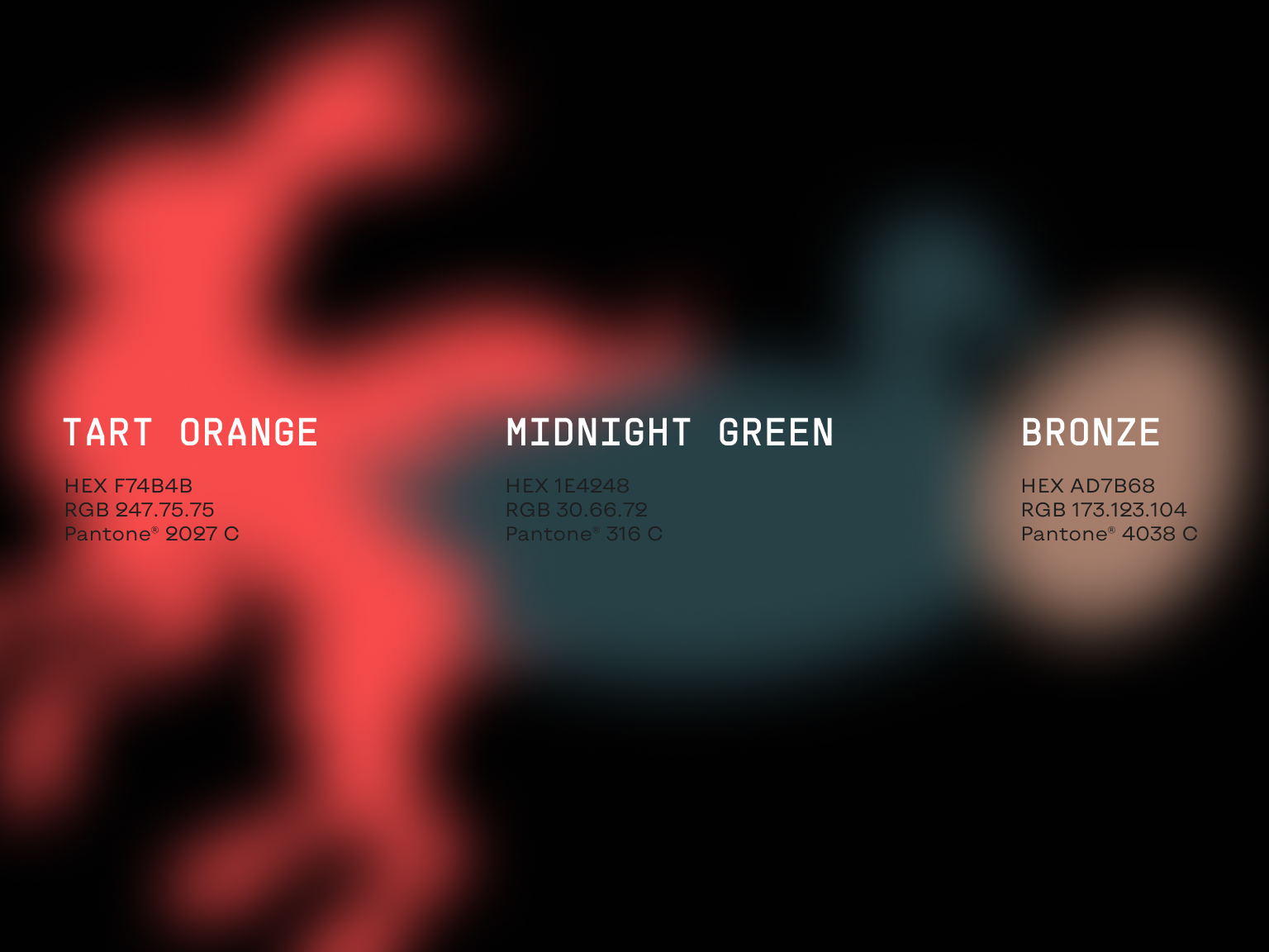
The color palette in calm dark tones with a bright accent.
The basic dark solutions refer to the Khokhloma Volost and its world-famous craft, where a black background was the basis for painting in red, green, and gold tones.
Process
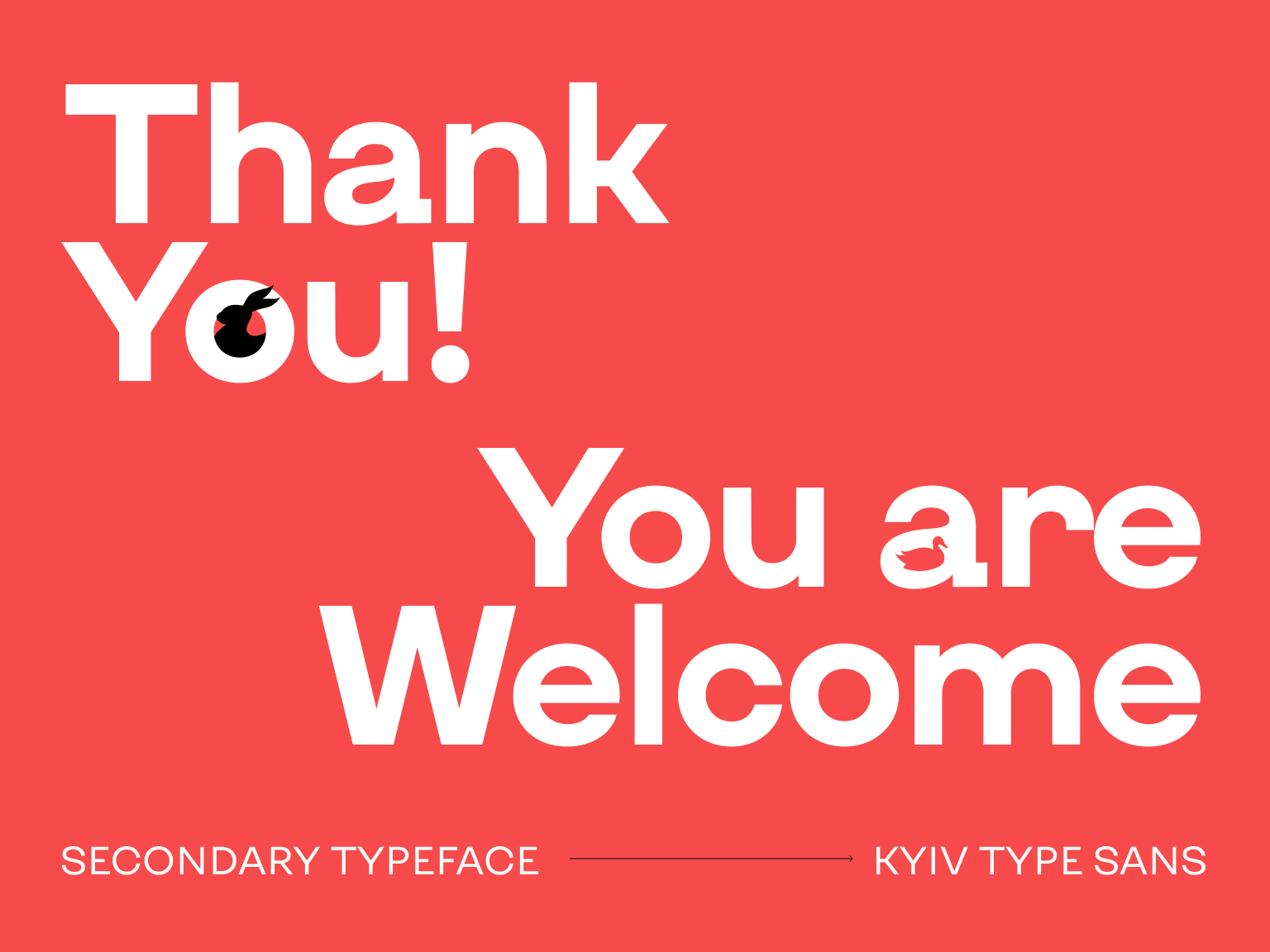
On the contrary, the font solution contrasts with the abundance of decorations typical for "Slavic" brands and is executed without serifs.
This provides a smooth transition to a modern reading, and the restaurant is not perceived as a quintessentially Russian cuisine with borsch, vodka, and other archetypical attributes.
